
Visualizing Data Trends: Crafting an Adaptable Insights & Highlights Template for USAGov
Insights and Highlights is a quarterly infographic series designed to track and visualize USAGov user behavior trends. The project involved analyzing complex data, identifying key insights, and creating a reusable, modular template for clear and engaging reporting.
The Problem
USAGov leadership needed a more efficient and adaptable approach to track and communicate overarching user behavior trends across multiple platforms. The challenge was to analyze large, complex datasets, distill the information into actionable insights, and present these findings in a format that was both reusable and visually engaging. This required creating a system that could simplify intricate data points into clear, digestible trends while ensuring the final deliverables were accessible to a diverse audience, including non-technical stakeholders.
My Role
As the lead designer and editor, I played a pivotal role in transforming complex data into clear, actionable insights, ensuring that USAGov leadership had the tools needed to track and communicate user behavior trends effectively.
My responsibilities included:
-
Data Trend Analysis: Conducted in-depth reviews of user behavior analytics, identifying key patterns and trends over time. I distilled complex data into meaningful insights, providing leadership with the critical information needed for informed decision-making.
-
Content Collaboration and Refinement: Partnered with cross-functional teams to streamline content, ensuring it was concise, logically structured, and aligned with the data context. My focus was on making sure that the message was clear and resonated with both technical and non-technical stakeholders.
-
Template Design and Innovation: Spearheaded the design of "Insights and Highlights," a modular infographic template for quarterly reporting. This reusable and visually engaging format enabled consistent, efficient communication of key insights.
-
Collaborative Design Process: Used Mural to map out adaptable, interchangeable modules for data visualization, promoting team collaboration and ensuring flexibility in the template's future use.
-
Final Design Execution: Developed the final deliverable in Adobe InDesign, incorporating customizable icons, graphics, and charts that allowed for easy updates and scalability. This ensured that the template remained relevant and effective for ongoing reporting needs.
Strategic Data Visualization and Storytelling
To gain a comprehensive understanding of the data, I utilized a whiteboard app to visualize and explore the data on a larger scale. This allowed me to identify key patterns and trends, while also starting to build a compelling narrative around the findings. By mapping out the data visually, I was able to uncover connections and insights that might have otherwise been overlooked, setting the stage for a more impactful and engaging presentation.

Developing a Modular System for Visual Data Reporting
Building on the insights from the previous stage, I took the thought process further by developing a modular system for visually reporting data. Using the same whiteboard app, I began to design flexible, interchangeable modules that could be adapted to various reporting needs. This approach allowed for a more dynamic, scalable system that not only made the data easier to digest but also ensured it could be consistently updated and customized in future reports.

The Final Product
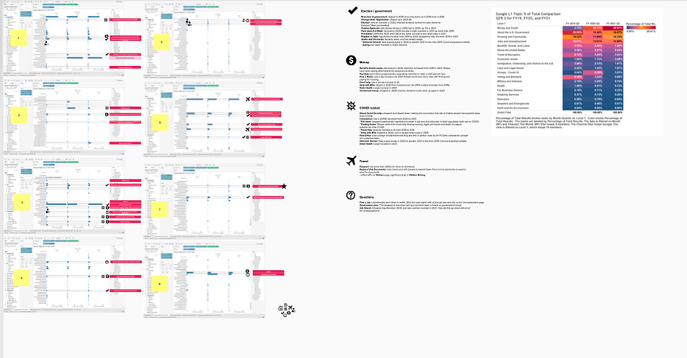
The "Insights and Highlights" series became USAGov’s official quarterly infographic, empowering leadership with a clear, adaptable tool for communicating data-driven insights to stakeholders.
By adopting a modular approach, we significantly reduced production time while enhancing the clarity and accessibility of the information. The design allowed for seamless updates and customization, ensuring the tool remained relevant and effective over time.
Leadership now had a visually compelling and reliable resource, streamlining the communication of key trends and enabling informed, strategic decision-making across teams.


